
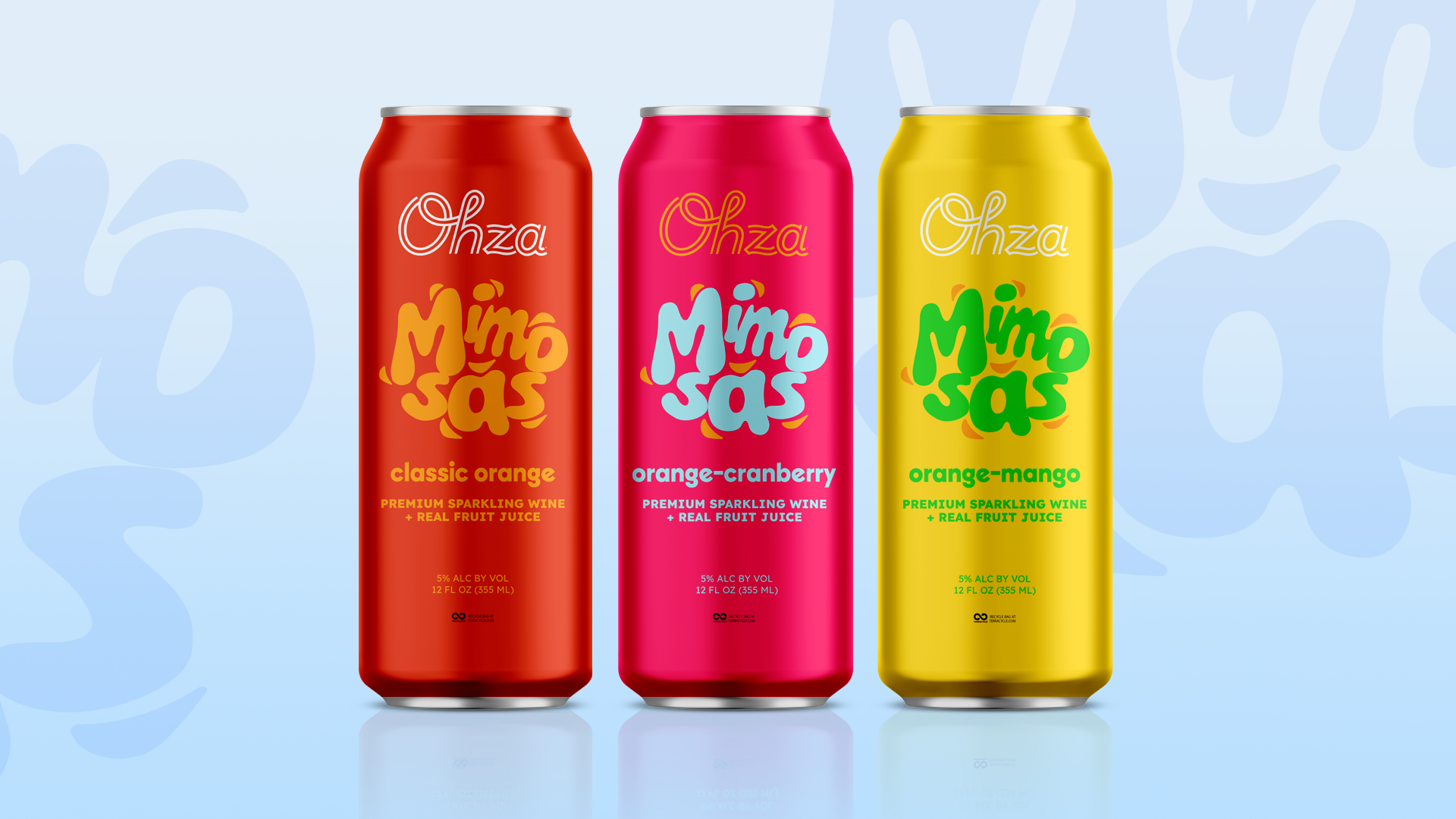
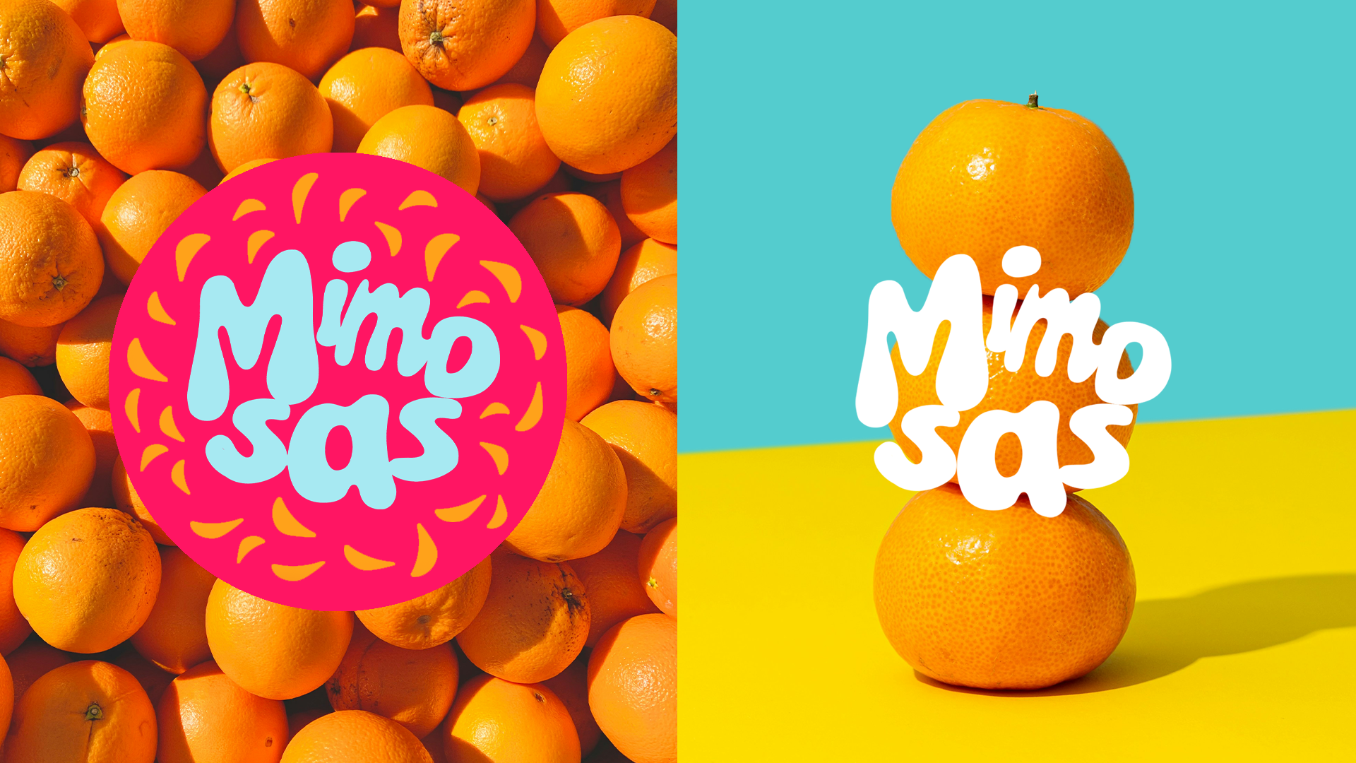
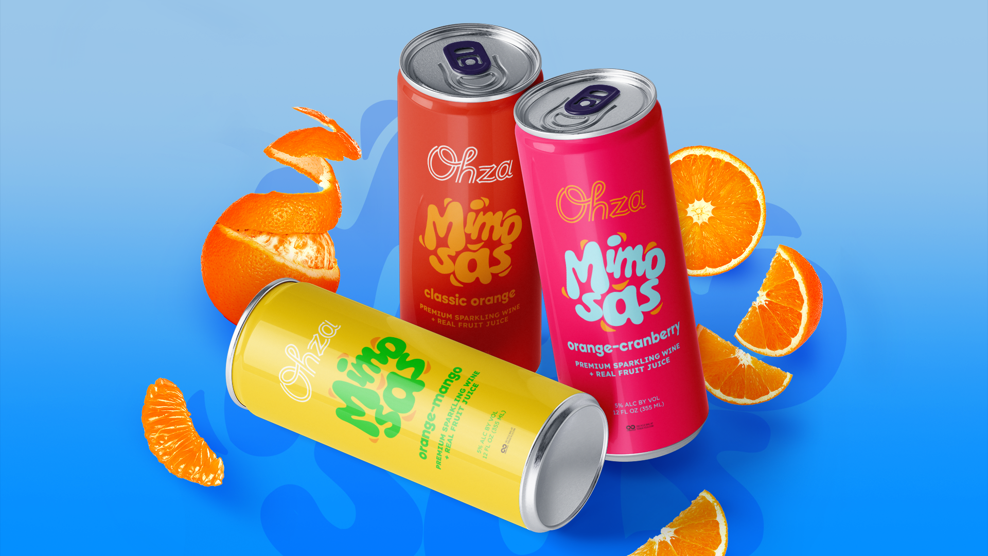
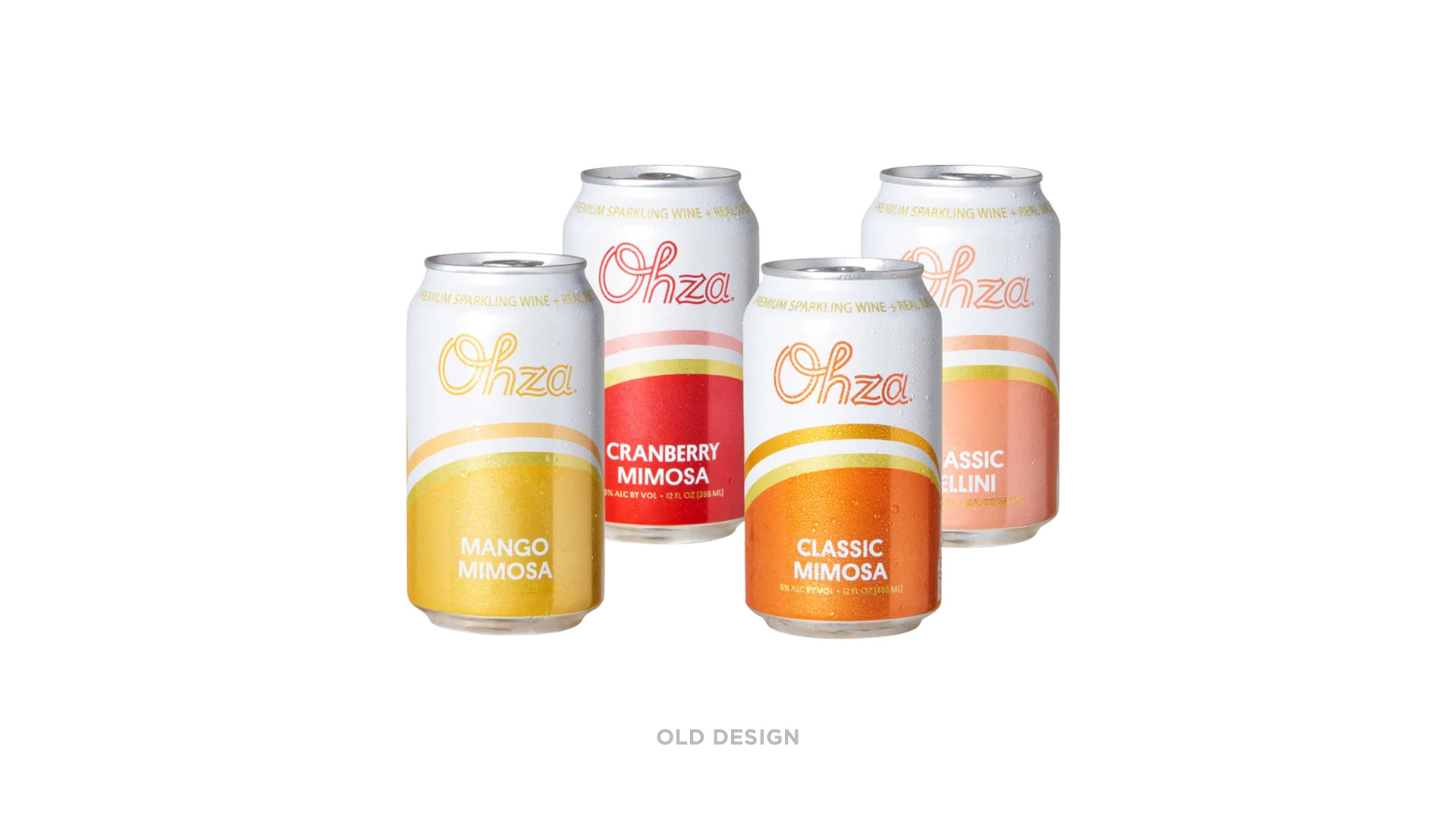
The task was to create a specific sub-brand for Ohza Mimosas that had its own logo – something juicy, beachy, and fun. The solution uses abstract orange slices interacting with the typography to give it a sense of movement. The slices also help retain the orange flavor cue that all the mimosas have as a base.
Art direction, brand design, packaging design, and copy by Adell Medovoy